Nexus Design System
A scalable multi-brand Design System to unify the experience of multiple brands into a single source of truth
ROLE
Lead UX/UI Designer
Background
- Applied extensive design audits to inform our standardization process. I was able to effectively map disjointed front-end libraries and unify them into a cohesive ecosystem for multiple brands.
- Executed end to end. The fact that the engineers and different product teams were able to adopt our single source of truth without refactoring overhead demonstrated our system’s scalability.
- It's worth noting that building a Design System is not an isolated effort. Each person from UI/UX to engineering contributed to standardizing accessibility and unifying visual assets across our diverse digital portfolio.
Understanding the problem
- Product squads were unaware of how their fragmented components were drastically impacting the overall loading time and visual consistency.
- Designers wanted to enforce brand guidelines rapidly but didn't know where to begin without rebuilding components from scratch.
- Engineers would be far more efficient if the UI layer was centralized, versioned, and easily importable via standard React components.
Redundancy Audit Mapping
Product vision and solution
- We want product teams to understand the impact of utilizing semantic design tokens.
- We want designers to take proactive actions to reuse patterns instead of creating ad-hoc fragile solutions.
- We want engineers to reduce technical overhead when applying extensive multi-brand themes.
As a starting point, we each did some deep codebase audits to investigate current offerings across the ecosystem, taking inspiration from the modularity of isolated UI frameworks in the market. I then conducted weekly synchronization sketching sessions to encourage cross-functional alignment and draw out architectural visions.
Defining the MVP
Based on the comprehensive audit sessions, it was revealed that there were extremely common structural gaps in our front-end foundation. We collectively identified and approved the following key architectural pillars for the MVP release:
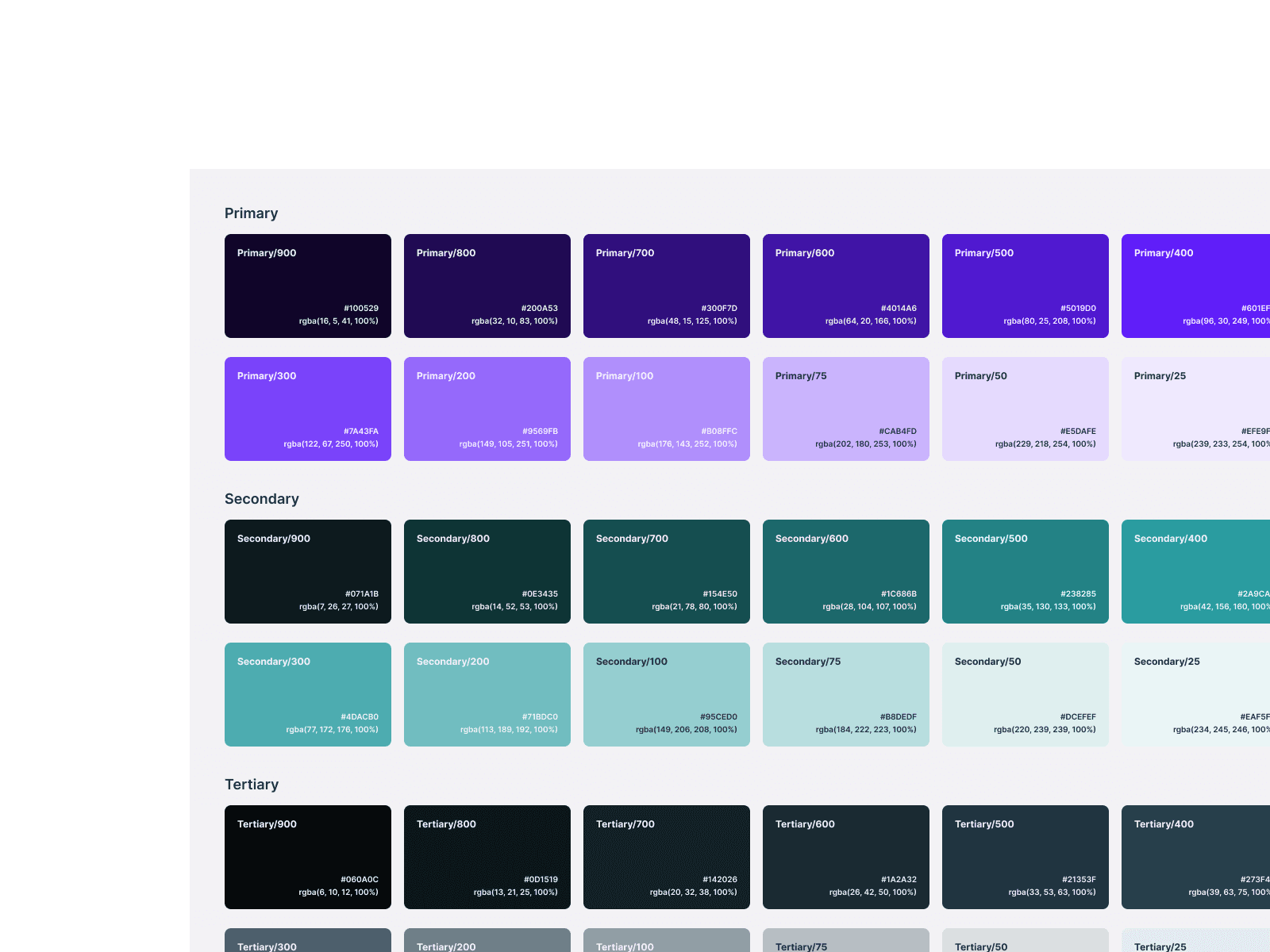
Foundational Tokens. Define exact color primitives, typography baseline, predictable grids, and semantic spacing to be globally consumed.
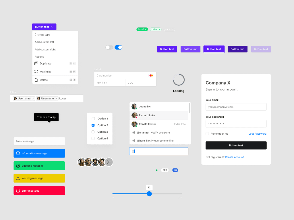
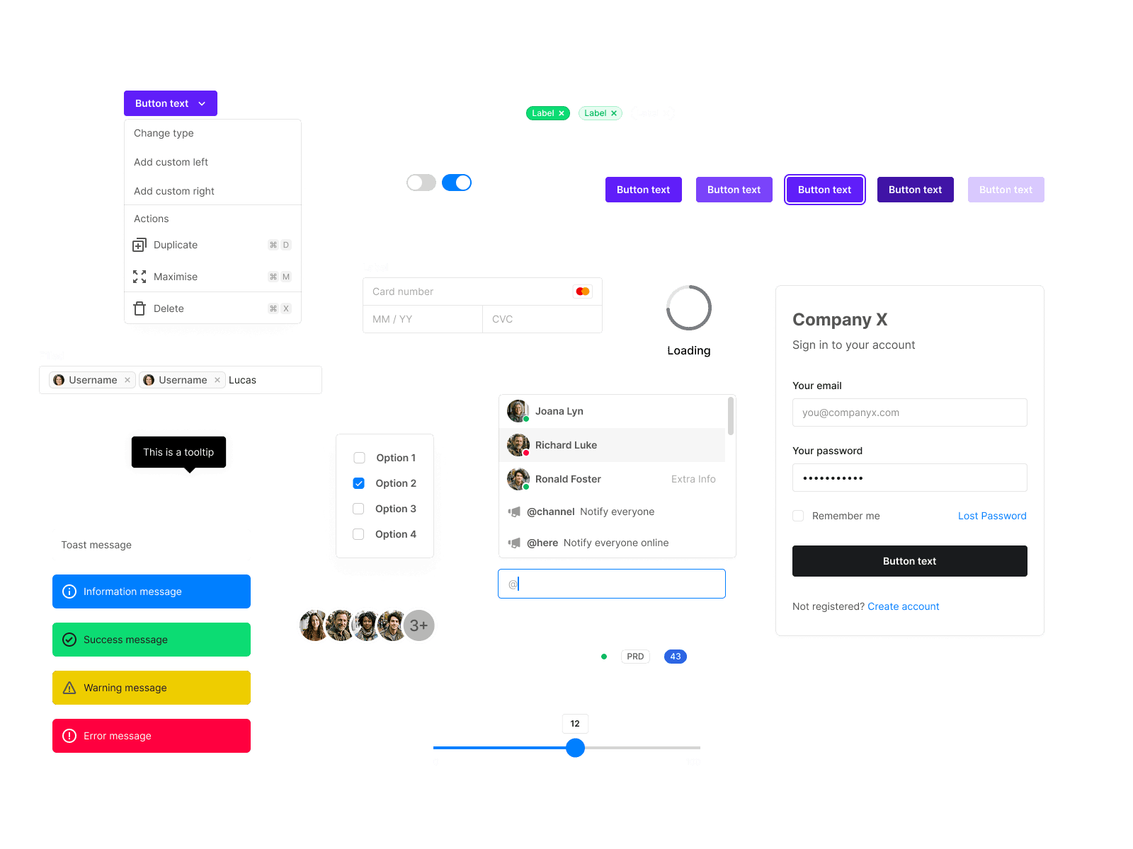
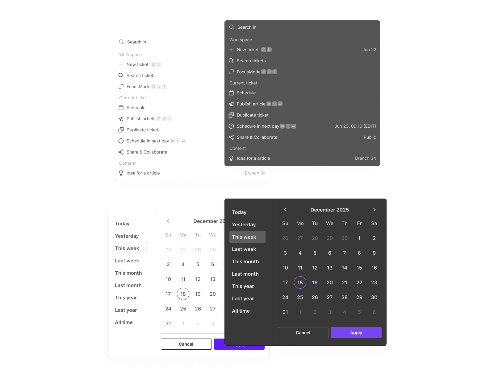
Core Interactive Components. Receive an immediate library of atomic units e.g. accessible buttons, data inputs, rigid form controls, and toggles.
Documentation Platform. View technical usage guidelines dynamically mapped inside our documentation portal (incorporating best practices).
Theming Engine. Earn massive scale by simply allowing a singular codebase component to automatically and completely re-brand dynamically based on injecting CSS variables.
Designs
With the project clock aggressively ticking and multiple partner squads anxiously adopting our early beta library, I quickly consolidated the foundational user journeys into generic high-fidelity mockups mapping all variable assets. I overwhelmingly opted for a refreshing modular minimalist look showcasing the reliability and the absolute flexibility of the UI components interacting harmoniously in a genuine screen space.

Development
I heavily utilized comprehensive handoff workflow interfaces embedded across Storybook parameters to natively empower front-end engineers to deeply inspect exact CSS/HTML behaviors seamlessly directly overlapping Figma. Operating dynamically entirely under Tailwind CSS specifications, our talented dev team efficiently shipped pristine stable versions of React Native alongside DOM React packages flawlessly wrapped across NPM pipelines.
Results and takeaways
The best global systems inherently come from constant collaboration. It was deeply inspiring to witness back-end mindsets unifying workflows securely. Ultimately, breaking down the massive barrier of highly isolated components drastically leads to unprecedented agile development iterations.
Design thinking and absolute Tokenization is absolutely paramount to effective digital scalability. Creating a rigid backbone frame populated with dynamic design tokens definitively ensured visual health without completely losing any UI modernization momentum even in complex global brand updates.
Always prioritize the crucial Developer experience. Complex Design systems are predominantly daily tooling platforms for diligent engineers basically. Establishing a streamlined, friendly sandbox environment alongside simplified documentation syntax phenomenally catapulted adoption rates within internal communities without friction.