Background
The fintech market in Brazil is notoriously rigorous, dominated by colossal traditional banks and aggressively contested by the rise of digital-native neo-banks. Despite the abundance of solutions, individuals often find themselves navigating convoluted interfaces filled with hidden fees and perplexing transactional requirements.
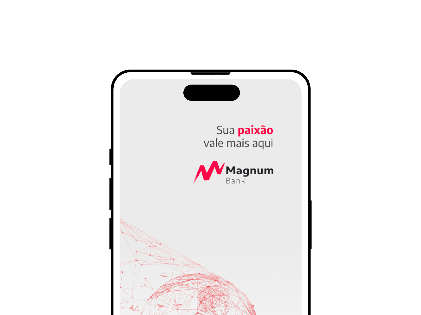
Magnum Bank was conceived as an intersection between transparent financial agility and user-centric emotional connection. Their core philosophy, "Here your passion is worth more", demanded a holistic design approach. We applied aggressive design sprints to unpack the industry baseline, define our architectural foundation, rapidly prototype, and ship a disruptive banking product.
Understanding the problem
- Consumers felt financially alienated, lacking awareness of the direct impact of micro-fees on their savings.
- Young adults wanted to take action to control their complex expenses but didn't know where to begin without feeling judged.
- Small business owners needed their banking impact to be structurally quantifiable and transparent.
Primary user frustration factors mapping
Product vision and solution
As our starting foundation, we executed extensive market research across legacy and modern banking competitors. We needed an ecosystem where users could intuitively orchestrate their expenses, execute instant transfers, and clearly observe their financial ascension.
Value Proposition & Target Audience
Nubank
- •Core Focus: Extreme simplicity, iconic purple design, and the end of banking bureaucracy.
- •Primary Audience: Mass market, strong organic and early adoption.
- •Current Challenge: Retaining high-income customers (Ultravioleta) without compromising its simplified essence.
- •Insight: The 'purple card' became synonymous with the 'first credit card' for millions.
Banco Inter
- •Focus: Bold 'Super App' strategy, concentrating Shopping, Investments, and Global Accounts.
- •Core Offering: Drastic absence of fees, attracting price-sensitive customers.
- •Primary Audience: Beginner investors and digital convenience seekers.
- •Current Challenge: Balancing aggressive marketplace expansion with banking reliability.
C6 Bank
- •Focus: Constant nod to exclusivity and VIP status with toll tags and color personalization.
- •Primary Audience: Middle and upper class, highly leveraged on premium rewards.
- •Current Challenge: The scale of acquisition cost versus granted credit limits.
- •Attraction: Transparent loyalty program (Átomos) with clear conversion rules.
Mercado Pago
- •Focus: Complete synergy with its native transactional ecosystem (Mercado Libre).
- •Primary Audience: Independent merchants, entrepreneurs, and the unbanked.
- •Current Challenge: Mentally repositioning from a 'mere digital wallet' to a 'primary bank'.
- •Attraction: Immediate accessibility to merchant credit tied to tracking sales data.
UX/UI Patterns
Nubank
- •Architecture strictly focused on 'one problem per screen'.
- •Home Page: Balance highlighted at the top with infinite vertical scroll for secondary cards.
- •UI Cleanliness: High density subtly tucked away in deep links to hide complexity.
- •Accessibility: Aggressive contrast (purple, black, white) prioritizing fast scanning.
Banco Inter
- •Menu Architecture: Constant bottom tabs paired with vertical 'drawers'.
- •Critical UX Challenge: High cognitive load on the Home Page due to competing icons and products.
- •Invasive Cross-Selling: Promotional banners often break the primary banking workflow.
- •Navigation: Requires a learning curve for those simply looking for essential banking.
C6 Bank
- •Design System: Dark pastel tones, refined typography, and luxurious white space.
- •UI Elegance: Interface designed to evoke the visual sensation of holding a 'Black Card'.
- •Main Access: Concentrates action buttons and statements closely at the bottom center.
- •Transitions: Polished micro-interactions and a highly cadenced Pix workflow.
Mercado Pago
- •Pragmatic Identity: Maximum focus on thick, conversion-driven Call to Actions in blue and yellow.
- •Speed: Transfers (Pix) and QR Codes placed in the front line of background navigation.
- •Visual Sensation: Exceptionally dense; resembles a large commercial billboard.
- •Thumb-driven scannability buttons facilitating under-pressure payments.
Critical Frictions (Opportunities)
Nubank
- •Premium users grow frustrated with the lack of fine granularity in investment platforms.
- •Systematic overuse of upsells on the home base for new accounts (unwanted loans).
- •Stagnant credit limits creating retention friction as customers' income brackets grow.
Banco Inter
- •Extreme sluggishness reported during heavy transitions due to massive app caching.
- •Chronic difficulty in recovering flows when a session times out.
- •Visual pollution inside the banking feed resulting from mixed e-commerce products.
C6 Bank
- •Occasional inconsistencies with preventive systemic blocks that hurt transactional trust.
- •Rules for Carbon tier access and tax exemptions are poorly communicated by the interface.
- •Delays in finalizing biometric KYC during initial onboarding flows.
Mercado Pago
- •Constant conflict between trying to manage corporate money versus finding routine transfers.
- •Users frequently lose their bank statement history amidst POS machine lists and link charges.
- •Chronic difficulty in segregating individual (PF) and corporate (PJ) profiles without logging out.
Customer Service & Backoffice
Nubank
- •Tier 1 (IVR and Chatbot) is exceptionally fast and trained in high-precision NLP.
- •Hidden Challenge: The UI relentlessly pushes users into automatic flows, demanding persistence to reach humans.
- •Once with an agent, data retention and contextual history (First Contact Resolution) are phenomenal.
Banco Inter
- •Cascading Service: Support deflects vertically by demand type, causing internal queues.
- •Users criticize the need to reconnect fully if battery is lost during customer service wait times.
- •Resolution of critical incidents often suffers gaps or unhumanized closed loops.
C6 Bank
- •Main challenge tied to the integration between user accounts and backoffice generated tickets.
- •Many critical disputes remain pending without traceable online status (lack of transparent tracking).
- •Onboarding exhibits high compliance friction, rejecting access with punitive flows instead of curative alternatives.
Mercado Pago
- •Aggressive prioritization of bots (support is fundamentally tied to the Mercado Libre retail network).
- •High-risk financial processes are often redirected to infinite FAQs, triggering severe anxiety.
- •Lacks a clear banking 'concierge' solution for moderate-transaction business accounts.
Defining the MVP
Based on our rapid sketching and whiteboard iterations, we consolidated the product vision into critical user journeys:
- Seamless Onboarding. Reduce account opening friction to under 3 minutes using OCR and facial biometrics.
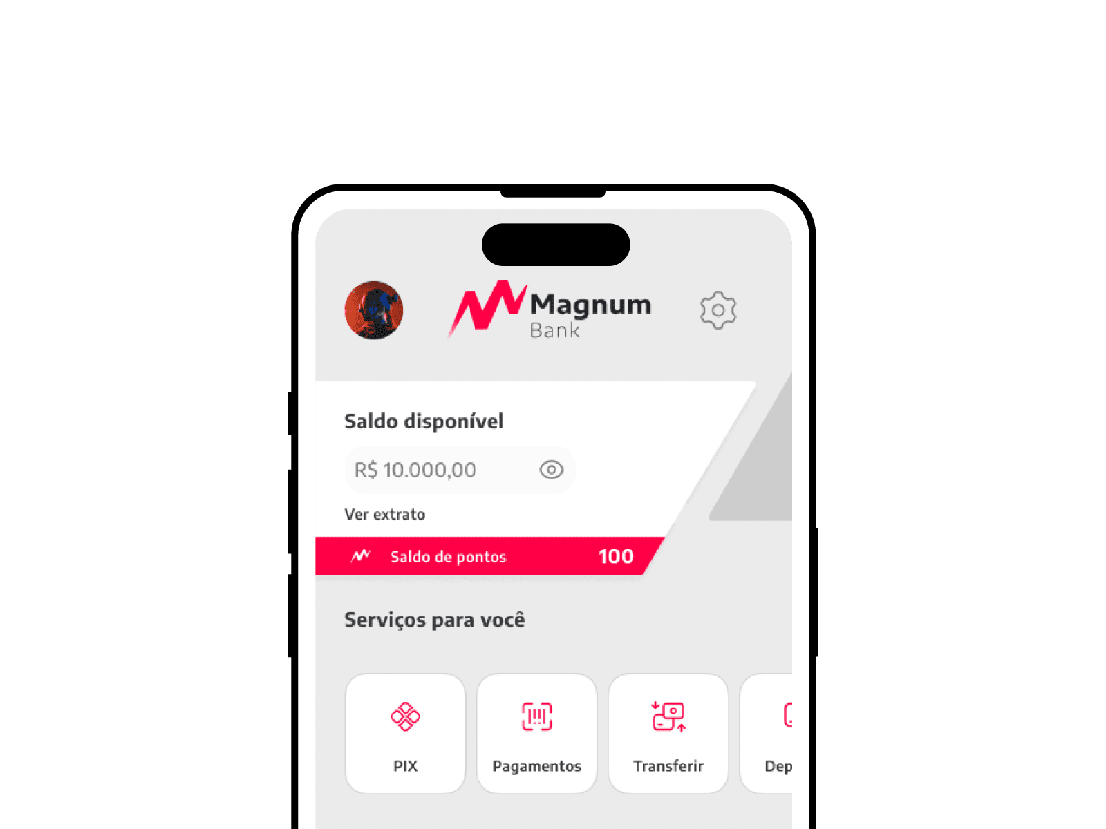
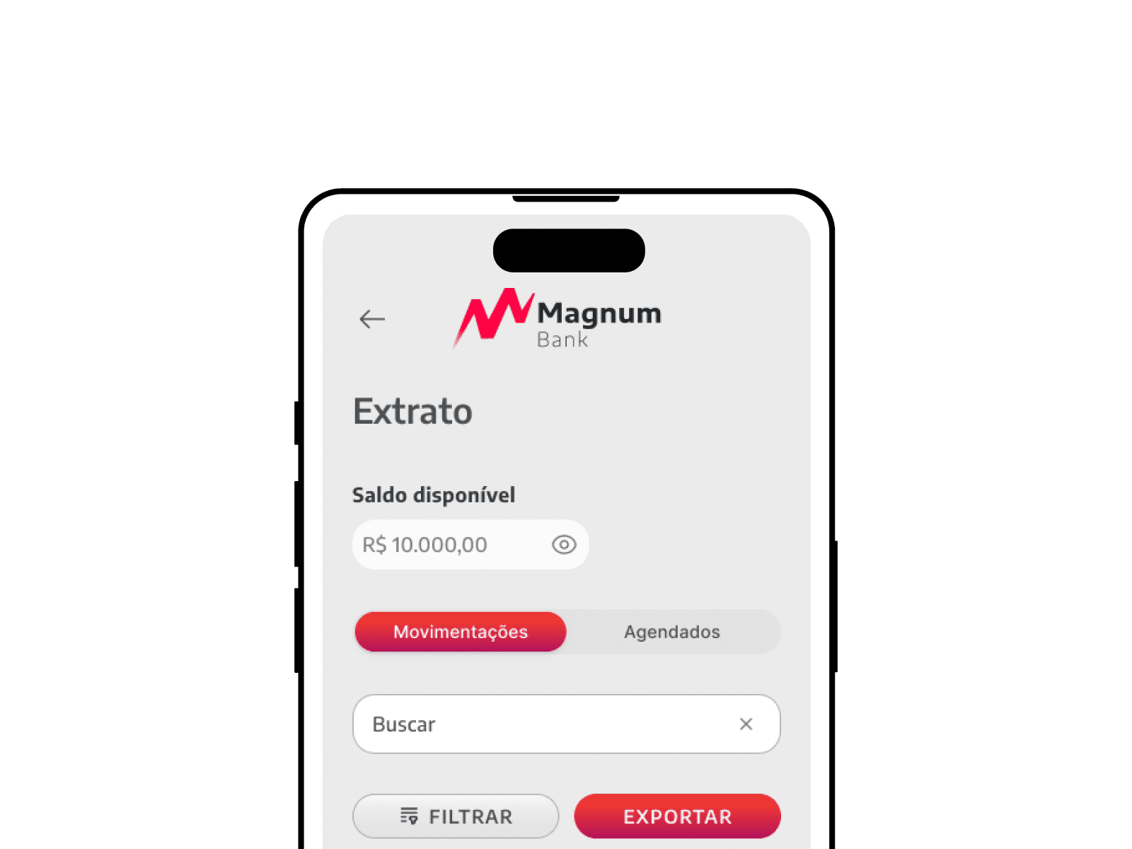
- Smart Actionable Dashboard. Receive automatic categorization of expenses into visual buckets.
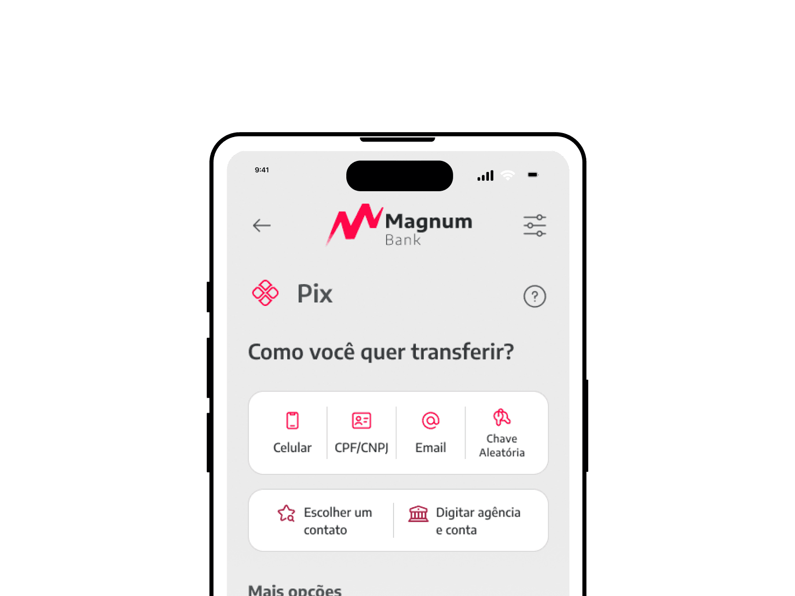
- Instant Transference. Eliminate the TED/DOC legacy anxiety with an entirely Pix-driven architecture.
- Earn Benefits. Connect financial milestones to the user's passion, rewarding them dynamically.
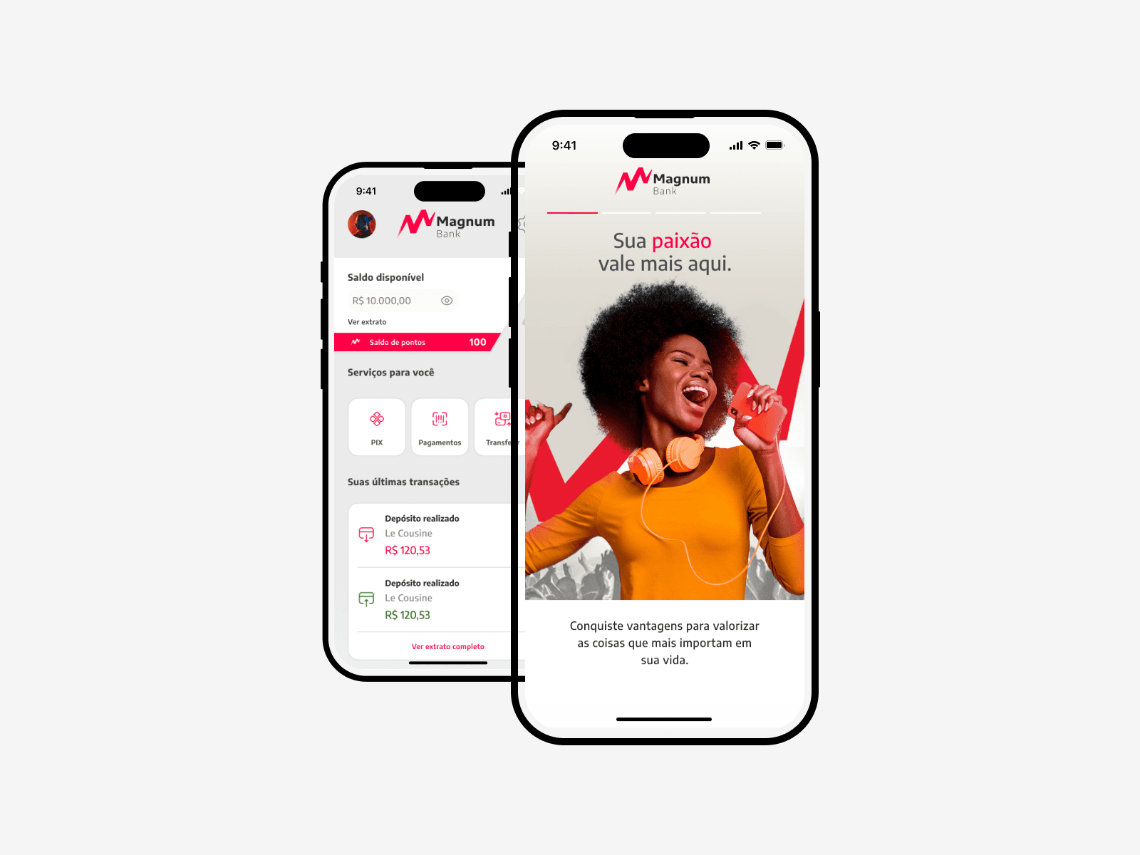
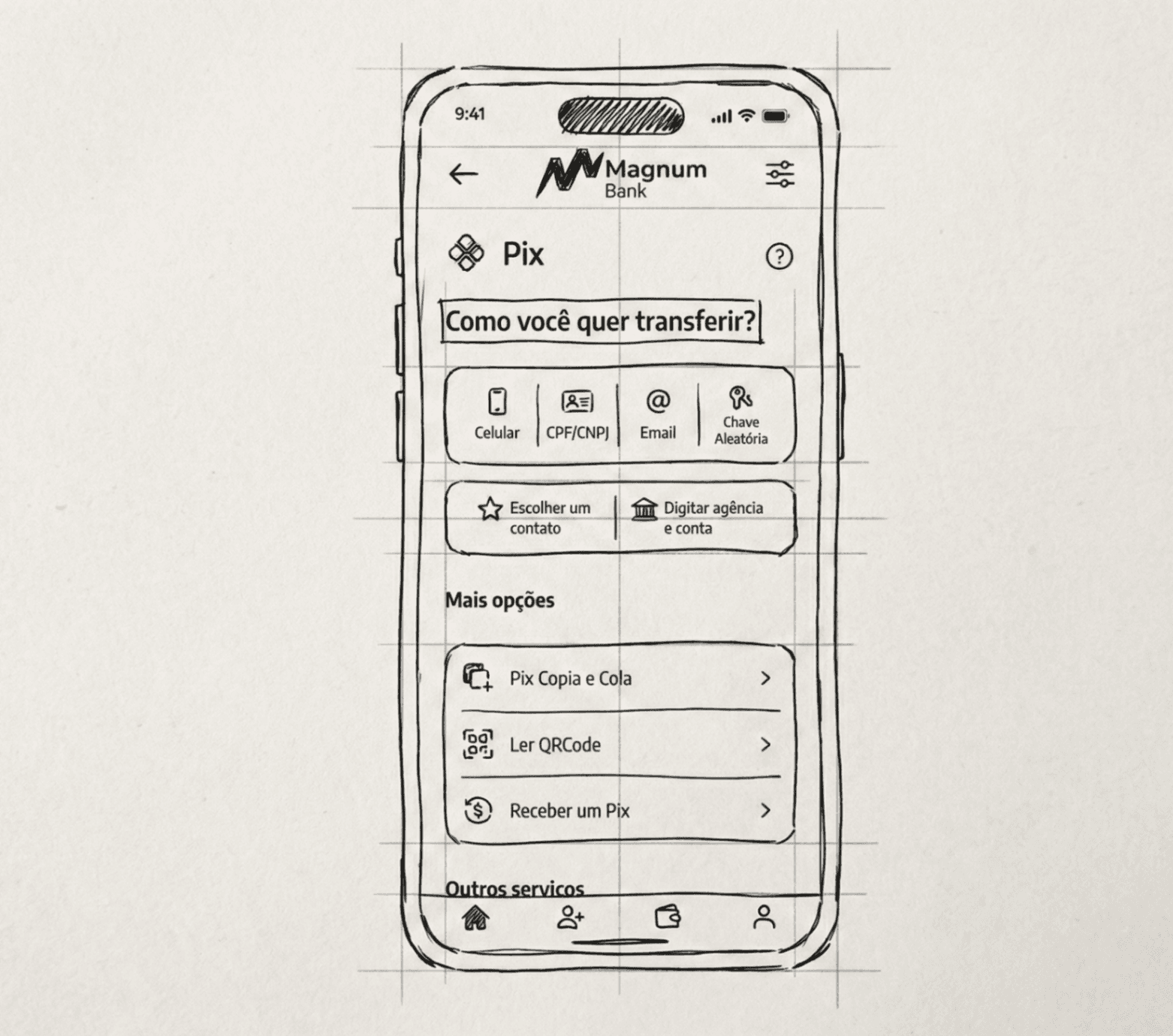
Before engineering the complex state management, I mocked up the main architectural screens for the MVP, effectively translating abstract flows into high-fidelity interaction zones.
Designs & Iterations
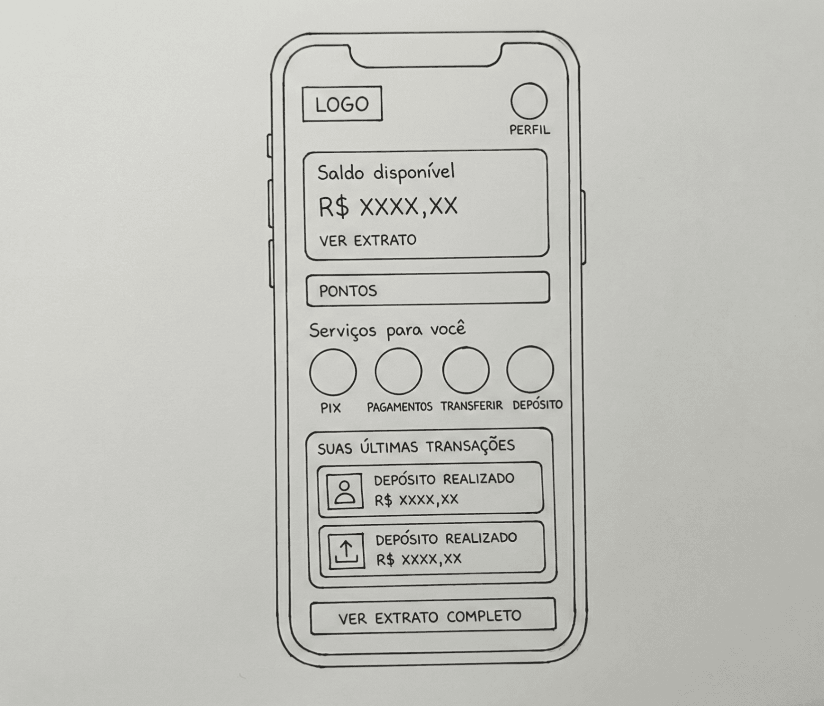
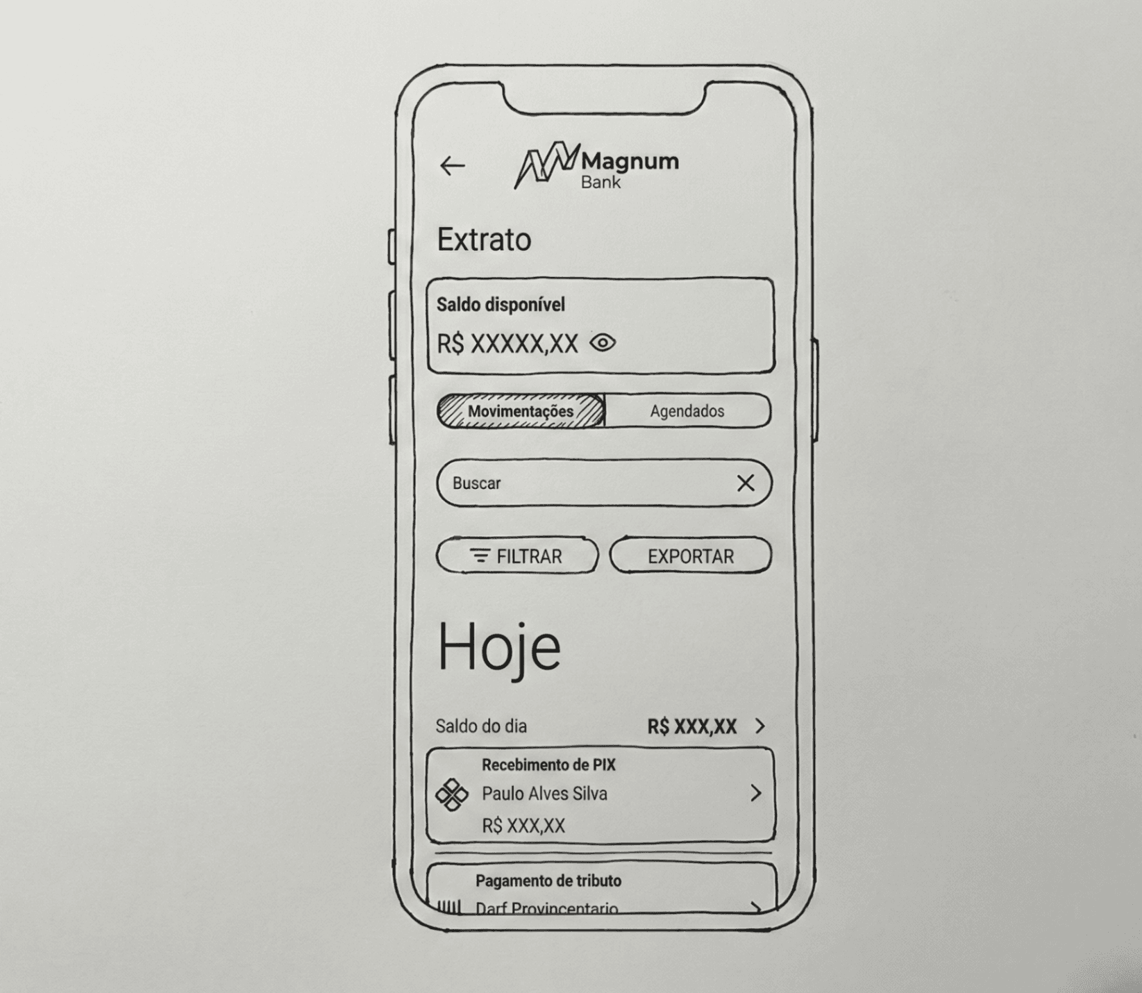
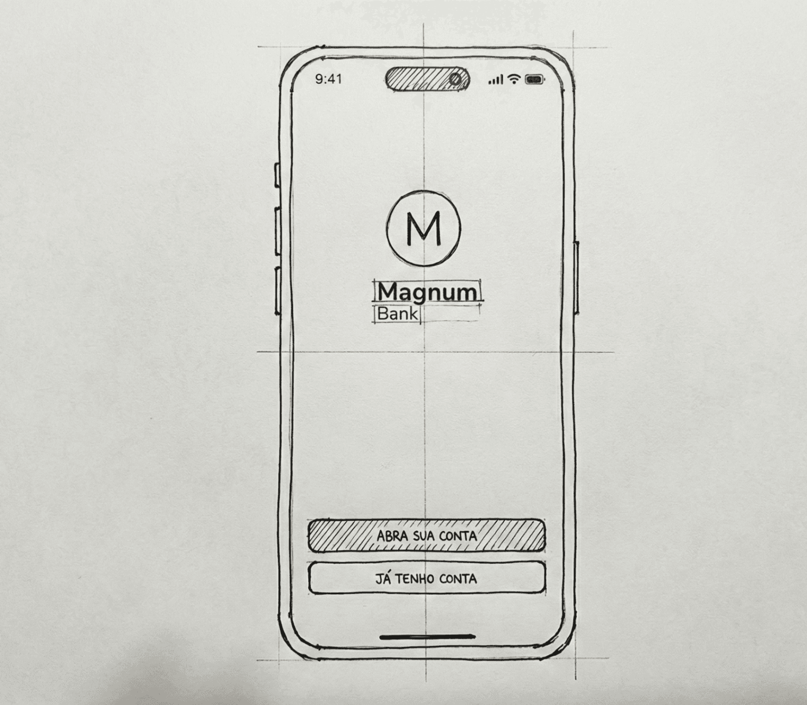
Navigating absolute time constraints, I transitioned directly into mid-fidelity wireframing to map the fundamental user journey, prioritizing extreme UI simplicity. The goal was to eliminate 'cognitive noise' – no redundant menus, no excessive gradients, just fluid transactional geometry.
Development
Using robust prototyping engines, I enabled the engineering team to deeply dissect the component hierarchy, micro-interactions, and spatial constraints. The native application was developed utilizing Flutter, allowing us to simultaneously target both iOS and Android ecosystems with a single unified codebase, accelerating deployment.
High-Fidelity Interface Patterns
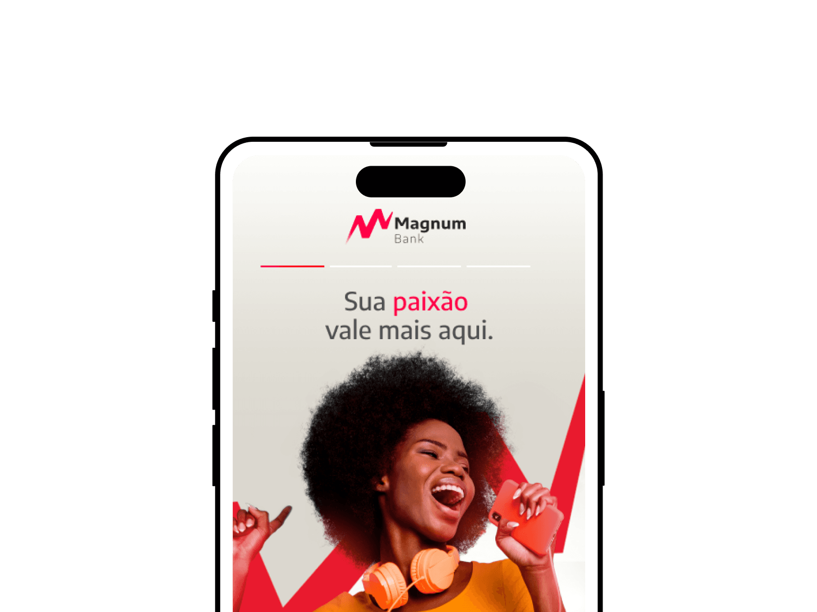
We opted for a bold, refreshing gradient identity backed by severe dark-mode structural hierarchy to evoke power and clarity.
Results and takeaways
Working in highly regulated, rapid-iteration cycles exposed critical lessons about product survival:
The best interfaces stem from multidisciplinary friction. The synergy between engineering logic and design empathy created highly refined, realistic solutions that neither team could reach independently.
First impressions dictate adoption lifeblood. The banking world is fundamentally driven by trust. Prioritizing an impeccably smooth onboarding experience proved extremely vital to secure early-adopter retention.
Design thinking aligns chaos. Applying strict lean frameworks helped anchor our debates and kept us strictly focused on delivering the core MVP features rather than indulging in infinite backlog expansion.